SUMMARY
Seal Spotter is a mobile application that allows beachgoers of all ages on the West Coast to send reports of sightings of seals and similar mammals. In addition to the mobile app, we developed a desktop database view for researchers to access the reports from.
PROBLEM
PMMC had already worked previously with another team to create the first version of Seal Spotter. However, this version had many functionality issues and an unsatisfactory user interface.
SOLUTION
After concluding that the first iteration was largely unsalvageable, my team worked to build a new Seal Spotter app from scratch, complete with new branding. Focus landed on clearer calls to action, incorporation of more information about PMMC, and aesthetics that appealed to all ages.
SPONSOR
Pacific Marine Mammal Center (PMMC), a nonprofit marine rescue and research organization based in Laguna Beach, CA.
ROLES
UI/UX Designer, Front-End Developer, Point of Contact
TOOLS
Figma, Visual Studio Code, Photoshop, Trello, Zoom
TIMESPAN
September 2021 - March 2022
Upon meeting with key stakeholders at PMMC that would be have the most interaction with the app, we determined requirements and the scope for the project. As we discussed the app, my team guided our clients through the more technical aspects they were unfamiliar with. We identified the key functions of the app as well as their subrequirements.

View Functional
Requirements Document
- Open app, are you trying to report sick or injured or dead animal
Pull up phone number of nearest facility based on gps location
Message saying: call number do not report thru app
prevent user from doing anything in the app other than report thru the number after marking animal as injured/etc
Have pop up asking if they’re reporting sick or a tagged seal, direct them to the correct steps
have safety/legal information like on current app
only for first time users (do not show again checkbox?) - Report findings effectively
- Organize and store data intuitively

To maintain consistency with PMMC's existing branding while bringing something fresh and approachable to the table, we took inspiration from ocean palettes and extracted colors from their website. Rather than using the same font as the website, we chose Nunito, a rounded and friendly sans-serif font, to appeal to a wider audience and foster enthusiasm for PMMC's mission among adults and children alike.
In order to maintain a cohesive brand with PMMC, we looked to their existing website for colors to build a palette to work with. While PMMC uses Montserrat, we chose to use the softer Nunito font to align more with the app’s kid-friendly design.
These are examples of the first iterations of the home page. Based on the client's insistence on maintaining that users are aware of safety precautions around marine mammals, we initially felt that "Safety Tips" / "Safety Information" buttons were just as important as the "New Report" and "Emergency Contact Information" buttons. However, we scrapped a third main button as we incorporated different ways to access and display the safety guidelines.

Relaying safety information to users was one of PMMC's top priorities. The initial version of Seal Spotter used icons that not only relayed unclear information but also looked confusingly like buttons. To simplify things, we removed the icons and stuck to a list format that also indicated whether certain rules applied to users based on whether or not they were aboard a watercraft.
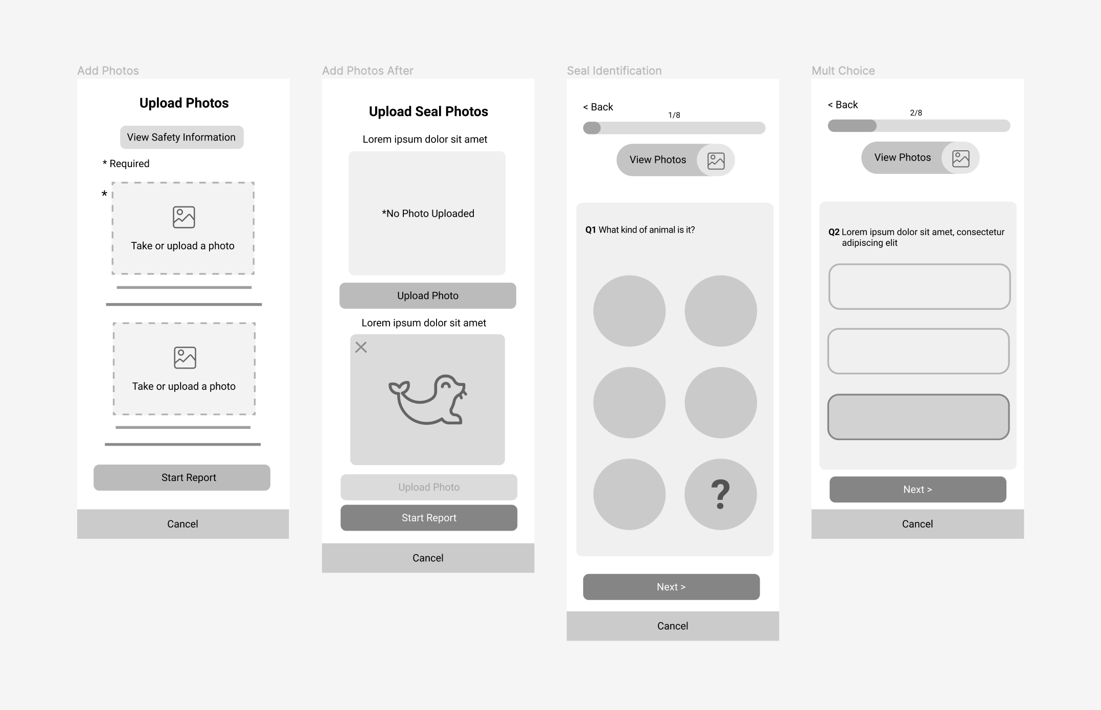
We found the first version of Seal Spotter's reporting process to contain questions that were either unnecessary or in need of further clarification. We simplified the flow, ensuring users had a smoother, more purposeful experience and PMMC had the information they needed.


PMMC needed a way to access the reports at a moment's notice. We made the report database accessible through a login-protected web app, developed with Ionic and Netlify. Scientists in need of Seal Spotter's data can browse through reports filtered by date, location, species, tag color, and tag location and select specific reports to be compiled and downloaded as an Excel file.


